When it comes to colour, few names are as iconic as Pantone. Renowned globally as the authority on colour, Pantone has revolutionised the way industries communicate about and use colour. In this blog, we’ll explore the history of Pantone, its significance, and its influence on trends, including the much-anticipated Pantone Colour of the Year.

A Brief History of Pantone
The Pantone story began in 1963 when Lawrence Herbert, a chemist and the owner of Pantone Inc., developed the Pantone Matching System (PMS). Before this groundbreaking system, colour communication across industries was inconsistent, leading to misinterpretations and costly errors. Herbert’s system standardised colour identification, ensuring that designers, manufacturers, and marketers could all speak the same “language of colour.”
Based in Carlstadt, New Jersey, Pantone started as a small printing company in the 1950s. Over the decades, it has grown to become the definitive standard for colour, with its influence extending far beyond printing to industries like fashion, interior design, and product manufacturing.
One notable milestone in Pantone’s journey was the introduction of the Pantone Colour Matching System for textiles, plastics, and other materials. This expansion made it easier for industries beyond printing to implement consistent colour standards, solidifying Pantone’s place in the global market.

Who Chooses Pantone Colours?
Pantone’s colours are curated by a team of experts at the Pantone Color Institute, a division of Pantone Inc. These specialists analyse global trends and influences to forecast colour directions. From fashion runways and film productions to socio-economic conditions and technological innovations, the team draws inspiration from diverse sources to decide on their colour palettes.
Their research process includes attending international trade shows, studying art exhibits, monitoring social media trends, and even examining consumer behaviour. This holistic approach ensures that Pantone’s colours are both timely and reflective of global sentiment.
The Iconic Pantone Colour of the Year
Introduced in 2000, the Pantone Colour of the Year has become a cultural phenomenon. Each December, the Pantone Color Institute announces the shade that will shape design trends for the coming year. This selection is not made lightly; it’s the culmination of months of research into current events, cultural movements, and artistic expression.
The Colour of the Year influences a wide array of industries. Fashion designers incorporate it into their collections, interior designers use it to set trends in home decor, and even packaging designers leverage the shade to appeal to consumers.
In addition to the main Colour of the Year, Pantone often releases a complete palette of complementary colours. This allows designers and creators to explore harmonious combinations that work well in various applications.

What Influences Pantone’s Colour Choices?
The choice of the Colour of the Year reflects the mood and aspirations of the global community. For example:
Cultural Events: Major global events, such as the pandemic, environmental concerns, or societal shifts, play a significant role.
Art and Design: Contemporary art exhibitions, digital art trends, and innovations in materials often inspire Pantone’s selections.
Fashion and Media: Trends from fashion weeks, viral moments on social media, and cinematic themes contribute to the decision.
Technology: Advances in technology, such as the rise of artificial intelligence and virtual reality, often influence the tones and textures that Pantone highlights.
Pantone’s 2025 Colour of the Year
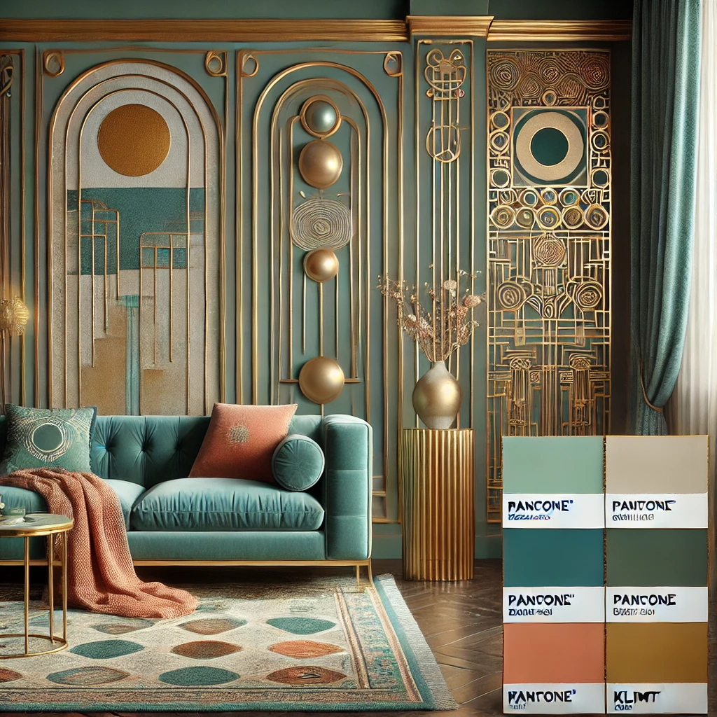
For 2025, Pantone has unveiled Mocha Mousse 17-1230 as the Colour of the Year, a hue that symbolises pleasure deliciousness. Complementing this shade, Pantone has introduced a coordinated palette designed to harmonize with the main colour. This year’s palette includes, deep navy, muted greays, soft creams and beiges, earthy greens and coral or teal, offering endless possibilities for creative expression.

Designers and creators can draw from this palette to craft products and spaces that resonate with today’s consumers.
Why Pantone Colours Matter to You
Whether you’re updating your wardrobe, redecorating your home, or designing your next product line, Pantone’s trends can serve as a guide. Their carefully chosen shades resonate with contemporary themes, making it easier for you to create designs that feel both timeless and fresh.
For example, if you’re working on a project that requires a bold and energetic vibe, you might use the Colour of the Year as a focal point. Alternatively, for a more subdued and calming effect, you could explore the coordinating shades in Pantone’s palette.
Fun Fact: Pantone Beyond Design
Pantone colours have even influenced pop culture. From celebrity red carpet choices to themed events and branded collaborations, Pantone’s reach goes beyond professional industries. For example, in 2016, Pantone collaborated with Sephora to create a makeup collection inspired by the Colour of the Year.
Pantone Travels
Pantone’s influence extends to global landmarks, too. In some cases, cities and organisations have lit up iconic structures in the Colour of the Year to celebrate its release. This level of impact demonstrates Pantone’s unique ability to unite communities through colour.
Pantone is more than just a colour company; it’s a cultural touchstone that unites industries and inspires creativity. By understanding the history, selection process, and influence of Pantone’s colours, you can stay ahead of trends and incorporate them into your own projects with confidence.

So, whether you’re designing a bag, redecorating a space, or simply curious about what’s shaping the world of design, Pantone’s palette is a treasure trove of inspiration.
What's Your Favourite? What’s your favourite Pantone shade this year? Share your thoughts with us—we’d love to hear from you!


Comments